The Sycamore Church of England Trust & Schools Branding
Multi-Academy Trust Branding | Logo Design | Website Design
Multi-Academy Trust Branding | Logo Design | Website Design

The Sycamore Church of England Trust recently embarked on a significant rebranding initiative. This project aimed to refresh its identity while emphasising its strong Church of England faith foundation. The primary goal was to create a cohesive and distinctive brand identity that resonated with students, parents, staff, and the broader community, while also reflecting the trust’s deep-rooted Christian values. The rebrand involved The Sycamore Church of England Trust and its three founding schools: St John’s CE Primary School, Radcliffe Hall CE/Methodist Primary School, and Christ Church CE Primary School. Faith was central to this project, guiding the creation of every element. As the trust expanded, St Stephen’s CE Primary School joined, and its branding was seamlessly integrated into the overall strategy, ensuring a consistent representation of their shared Christian ethos.
The rebranding process began with developing a new identity for the trust itself, which prominently featured the Church of England’s faith. The Sycamore Church of England Trust’s new logo displays a stylised sycamore leaf, symbolising growth, unity, and faith. This is a direct representation of the trust’s Christian foundation. The green colour palette embodies nurturing and sustainability, while the tagline “Grow together, Learn forever” encapsulates the trust’s commitment to continuous learning through a faith-based community. Each school received a unique logo that reflects its individual character while strongly aligning with the trust’s faith-centred brand. Importantly, all school logos feature a gold ‘halo’ device and are encapsulated within a secondary circular design, which ties them together visually across the trust:
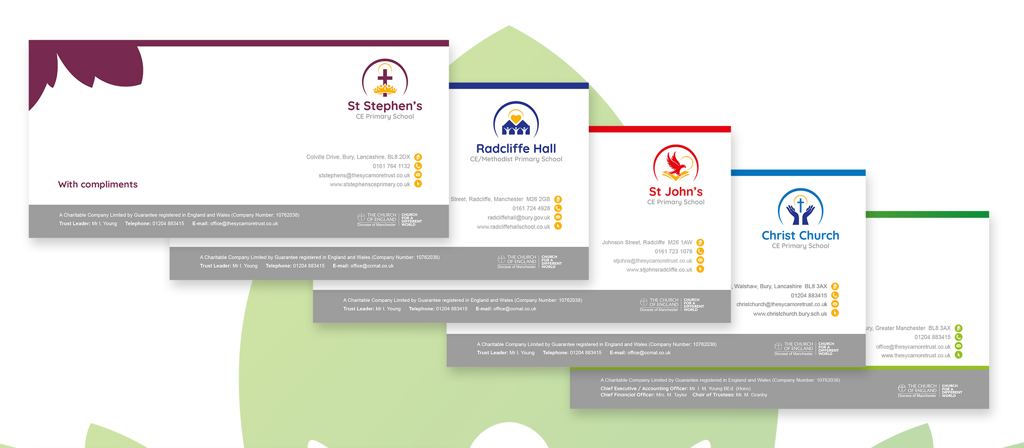
St John’s CE Primary School: The logo uses a vibrant red colour scheme, with a golden accent colour which is also used across all school logos. It feature an eagle which symbolises St John, and the strength and vision drawn from Christian teachings.
Christ Church CE Primary School: The logo showcases a blue palette with the signature gold accent. It includes hands uplifted in prayer beneath a cross, clearly emphasising the school’s commitment to Christian faith and values.
Radcliffe Hall CE/Methodist Primary School: This logo uses a deep blue colour with the gold accent. It features three figures within a stylised icon of Radcliffe Hall below a heart. It symbolises love, unity, and the school’s Methodist and Christian heritage.
St Stephen’s CE Primary School: The logo incorporates maroon with the signature gold accent. It depicts a cross within a crown. This represents St Stephen, martyrdom, faith and a commitment to excellence, central to the school’s values.
Although each school’s logo is unique, all share design elements that ensure a cohesive look across the trust. The circular design and unified typography visually connect the schools, reinforcing their shared Christian values and their unified relationship with The Sycamore Church of England Trust. The gold ‘halo’ device and secondary circular encapsulation further enhance this unity, providing a consistent visual thread across all logos. In addition to the new logos, we designed and built websites for each school and the trust itself, ensuring a seamless online presence that reflects the rebranded identity. Our team also developed a complete suite of branded marketing materials, including stationery such as letterheads and compliment slips, to maintain consistency across all communications. Additionally, we created document templates with the new branding, allowing for easy editing and ensuring that all internal and external documents align with the trust’s refreshed visual identity.
The rebrand has been very well-received, especially by the school communities and external stakeholders who value the trust’s faith-based approach. The new logos provide a fresh and modern identity, making the schools easily recognisable while reinforcing their shared Christian values. Additionally, the consistent branding across all schools has strengthened the sense of unity and belonging among staff, students and families. By focusing on each school’s distinct identity while maintaining a unified brand, The Sycamore Church of England Trust has successfully positioned itself as a forward-thinking educational organisation. The rebrand not only modernised the trust’s visual presence but also strongly emphasised its commitment to Christian values, laying a solid foundation for future growth. This rebrand demonstrates the power of a well-crafted identity in strengthening an educational organisation’s mission. A strong, cohesive identity that reflects core Christian values can significantly impact community engagement and school pride. If you would like to find out more information about our branding services for MATs and schools, please contact us.

We’re a specialist education marketing and design agency, combining creativity, strategy, and hands-on expertise to deliver branding, websites, and marketing that make an impact. We take the time to get to know your school and its values, ensuring that everything we create feels authentic, meaningful, and tailored to education. Most importantly? We care about what we do, and we care about our clients. That means clear communication, fresh ideas, and a collaborative approach from start to finish. No fluff, no jargon, just great work and real results.
Trigger Education,
33 Devonshire Road,
Salford,
M6 8HZ
Manchester Office +44 (0) 161 279 6182
Brighton Office +44 (0)1273 249897